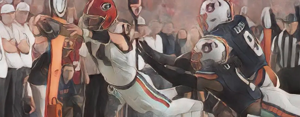
Can we talk about these?

I personally find these to be hideous. That’s just me. Also:

Whatever happened to these?

What’s the biggest uniform gaffe for Georgia athletics? If you had your choice, what changes would you make and why?
Can we talk about these?
I personally find these to be hideous. That’s just me. Also:
Whatever happened to these?
What’s the biggest uniform gaffe for Georgia athletics? If you had your choice, what changes would you make and why?
I agree. I don’t mind the gray so much, but the big G on the front is tacky. I’d prefer it to just say Georgia in an understated way.
And I don’t understand the different G on that hat or on Coach White’s quarter zip he was wearing. Why do other sports feel the need to change the logo?
That G on the hat was the baseball G during my time in school when the uniform was patterned off the Red Sox. I wish I still had that hat.
Most, if not all artistic value, related to UGA athletics passed with Mr. John Burton Davis Jr….GO DAWGS!!
The Power Rangers brought to you by Nike is and will forever be the most hideous uniform a Georgia sports team has ever worn. The black helmet in Jacksonville is right up with it. At least the silver helmet in the Power Rangers uniform was supposed to be a throwback to the pre-Dooley helmet.
Wear the black jerseys, Kirby, instead of using them for G-Day and recruit dress-up/picture day. They look great (don’t love the spiked collar, but I can get over that), and they are a school color unlike so many other that wear them … cough, cough … Tennessee … cough, cough. The 2007 black jersey with the red helmet and silver britches looked damn sharp unlike some Oregon abomination.
Power Rangers is the only answer.
Black pants in Jax was a bad look too, but like above the correct answer is the Power Rangers uniform.
Georgia has so much potential to have incredible baseball uniforms. Nike, as usual, ruins it. I hate the “Nike Bulldogs” they have added at Foley Field on the third and first base lines.
And…you are CORRECT that those Giant G basketball jerseys are hideous. Once again, brought to you by Nike.
The Georgia baseball jersey in the Red Sox font from the late 80s and early 90s was a classic.
The black pants in Tampa were awesome when we smashed Wisconsin and Ron Dayne.
I still prefer the 90s baseball jerseys over today’s.
Right. I just saw that Pic of Bobo directing the band that day. Good times.
I actually like the basketball uniforms except for the gray/silver. Should be black or red. Silver is always the accent not the primary.
Power Rangers for sure but I’m surprised more people don’t hate that high school looking crap we showed up in against Florida in ‘09. I never will understand that.
I mentioned the black helmet.
Road gray for basketball doesn’t bother me. I think we should go with the block G for basketball, though. The football G is just that.
The Power Ranger uniforms were hideous, as were the black uniforms in Florida. The only good thing about those uniforms is when people watch film of that ass-beating, they will wonder why Florida was running up the score on Grambling.
The modern bulldog head is the worst. Give me the old Uga snarling or give me nothing.
The black jerseys need to be used more. Also the “ice” look that the recruits love and all wear for their instagram pics (white helmet, jersey, and pants). If you are going to adapt everything else (stadium music, offensive scheme, defensive scheme, recruiting, nil) why not have some adaptation with the uniforms.
Agree except the white helmet. The helmet should never be messed with on a game day. I wouldn’t mind the white jersey with white pants for an away game every once in a while.
The alternate football uniforms that the recruits take pictures with are all pretty good (even the all white uniforms). There’s nothing wrong with changing it up as long as it is with school colors and is not ridiculous (2012 Power Rangers, 2009 UGA/FL). I personally like the Black Jerseys with the red helmets/silver britches and I prefer the SILVER britches over the gray pants that we’ve been wearing since 2008 (I think).
That modern bulldog (I refuse to call it a Dawg) head looks like some clip art out of Microsoft Paint. I’m sure there some former intern from Nike laughing his/her ass off about how they sold that to Nike management, and Nike got UGA to buy it.
The Nike swoosh is a douche, but they are not going to give up that revenue stream.
At least baseball can do a mix match of shirts and pants. I think each UGA sport should have a variation of the G logo or mascot rendering or something that identifies with the University and team.
Yes the power ranger uniform was the all time worst. I love the classic and constant look of the football uniforms. No need to be gimmicky with the sport that generates the largest viewership & revenue, looking at you Oregon, 10rc, ole miss.
Ole Miss’s powder blue looks nice when they wear them. Tennessee, Florida, FSU, Miami, Oregon, Ohio State and others wearing black is just stupid.
For example, Dabo Swinney deserves most of what gets sent his way, but you would never see him send Clemson out in Halloween costumes like Tennessee has done. The South Carolina people would crow about them wearing one of their colors.
I agree with you on our classic football uniforms. I like the look and I love the image. I picture other teams, especially their qb’s, looking over at the tunnel and thinking “Oh $#it, it’s Georgia.”
You don’t get that impact with Oregon’s uniform of the week club.
We’d probably like that Boise uniform better if we hadn’t dropped a turd on the field that day. That was one of my youngest son’s first games. The first was a loss to Vandy in Athens a few years earlier. Then there was the loss to LSU in the SEC championship. Thought I was gonna lose him and his twin sister (she didn’t go as often after Vandy) as Dawg fans, but they were students at UGA for the back-to-backs. Now they don’t miss a game!
No, the Boise uniform was still an abomination.
I have hated Nike far longer than I have hated ESPN…
power rangers. full stop.
I like the grey basketball uniforms, but agree about the football G detracting. A few times this year we wore the throwback-font jerseys, and I love those reminders of Willie Anderson and Alec Kessler (etc.).
And the baseball hats look *right* to me with the block G, again, not the football G
This is Dawg Vegas, btw. Though I’m logged in and can comment, my additions show up as from Anonymous
The power ranger uniforms, the black helmets and the red jerseys with black pants are all abominations and should never see the light of day again.
Okay, this Opelikadawg. WordPress has stolen my identity.
I would like SILVER pants that shine. Not the grey BS.
SILVER britches!! Exactly!
Great post. I might have to create some new basketball uniforms in Adobe next week. As many of y’all have noted, it is silver, not grey.
Power rangers now & always the worst, no matter what the outcome of that game was. I like that we don’t have a bunch of uniforms, I love tradition. That said I would love to see the black jersey against tech & the red pants in a road game each season. Maybe alternate them against tech each year. Ever since that steamy Knoxville night in 1980, I’ve loved those red pants!
All the different uniform colors, designs, fonts is just a scheme to sell more hats, jerseys, etc to the fan base. Oregon is the extreme but it is Nike U.